Add identity key help and reveal toggle to machine onboarding#2064
Conversation


Co-authored-by: npub1d6t84ajeg9skp2609l2k6axgcme8x7g7u7luj352r03hcwreg7lqnxcsex <6e967af659416160ab4f2fd56d74c8c6f273791ee7bfc9468a1be37c387947be@sprout-oss.stage.blox.sqprod.co>
Signed-off-by: npub1d6t84ajeg9skp2609l2k6axgcme8x7g7u7luj352r03hcwreg7lqnxcsex <6e967af659416160ab4f2fd56d74c8c6f273791ee7bfc9468a1be37c387947be@sprout-oss.stage.blox.sqprod.co>
A 'What's an identity key?' link fades into the landing footer after
two seconds (immediately on later visits) and opens a textured-card
explainer over the landing content with no backdrop dim or blur.

Design system: Card variant="textured" now applies the texture's
safe inset as default padding via --buzz-card-textured-safe-inset,
DialogContent gains overlayVariant="transparent" and
surface="none"/"textured" options, and the shared dialog close
button uses focus-visible so programmatic autofocus no longer draws
a ring on open.
Below 224px on either axis the nine-slice's opposing 112px inner
bands collapse into each other: the solid white center disappears
and the bands meet on a semi-transparent row of the fade, showing
the page background through as a thin seam line. The key-import
card (155px tall) hit exactly this. Enforce the floor in the
variant's CSS so the texture can never degenerate.
The identity key help dialog's body copy and X icon now use
--buzz-onboarding-backup-ink (#717106), the same olive ink as the
backup step's key text, so the dialog reads as part of the onboarding
palette instead of neutral gray. DialogContent gains a
closeButtonClassName prop so callers can theme the built-in close
button without recomposing it.
The spotlight key-import input now masks the pasted nsec by default
(type=password) with an eye toggle to reveal it, matching the backup
step's reveal pattern. The toggle only appears once there is input.
Typed key text uses --buzz-onboarding-backup-ink to match the backup
step's olive key treatment.
- Reset the reveal state whenever the field empties so a sticky
  reveal from a previous key never applies to newly pasted content
- Absolutely position the toggle with a fade so its appearance never
  resizes the input or shifts the centered key text
- Extract the shared olive icon-control classes into
  ONBOARDING_INK_ICON_CLASS in OnboardingChrome, following the
  existing onboarding chrome constant pattern
- Add committed E2E coverage for masking, reveal/re-mask, stale-reveal
  reset, layout stability, ink color, and narrow-viewport overflow
- Scope the docked-CTA spec's label and svg assertions so the new
  toggle (an icon button inside the textured card) doesn't trip them
dialog.tsx now imports card-texture.css for the textured dialog
surface, and node's ESM loader has no CSS support, so every unit
test that transitively imported the dialog failed with
ERR_UNKNOWN_FILE_EXTENSION. Vite handles side-effect CSS imports at
bundle time; the test loader now short-circuits them to empty
modules so components with style imports stay unit-testable.


|
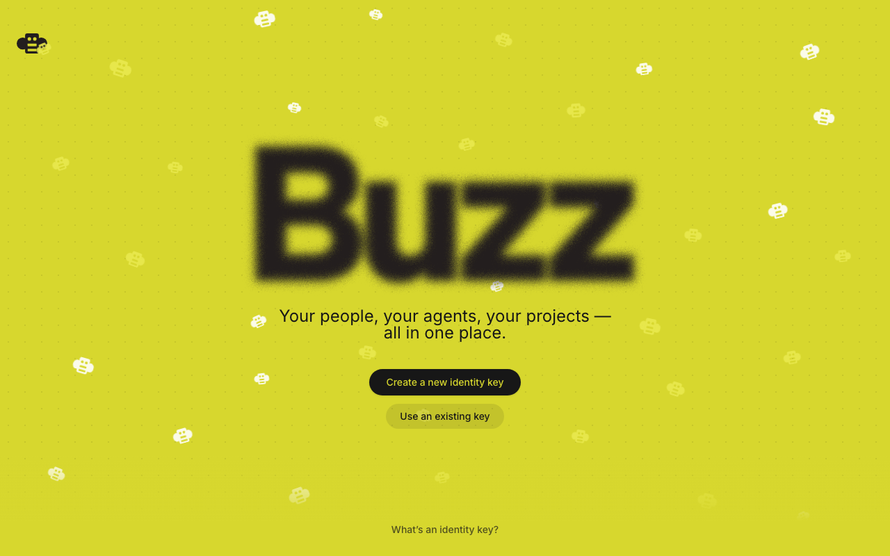
🤖 Screenshots for this PR: Landing with the help linkAfter 2 seconds (immediately on later visits), "What's an identity key?" fades in at the bottom center.
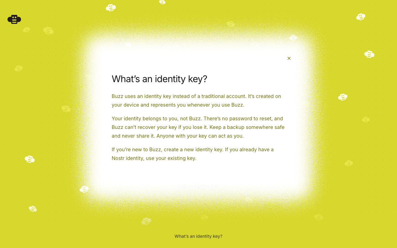
Identity key help dialogThe textured card overtakes the landing content with no backdrop dim or blur. Body copy and the X use the onboarding olive ink.
Key import, masked by defaultPasting a key keeps it masked; the eye toggle fades in without shifting the centered text. 
Key import, revealedRevealed key renders in the shared olive ink ( 
|
The npub preview previously reused the default variant's boxed alert
treatment (border, tinted fill, left-aligned), which read as a
form-validation banner under the designed textured card. The
spotlight variant now uses the backup step's caption language:
centered, unboxed, text-sm regular weight, with the npub in the
shared olive key ink. Success copy is now 'Nostr identity found'
and the waiting hint drops its period.

Also reserve the reveal toggle's footprint symmetrically (px-10) so
a revealed key never runs under the eye control and stays optically
centered.
The integration-project onboarding spec still clicked 'Enter a key',
which this branch renamed to 'Use an existing key'. The smoke-project
specs were updated with the rename, but the integration project only
runs in CI, so this one surfaced there.

 wesbillman
left a comment
wesbillman
left a comment
wesbillman
left a comment
There was a problem hiding this comment.
The new textured dialog makes its fixed viewport wrapper horizontally scrollable. At a 720×620 viewport I measure the wrapper at clientWidth=720 / scrollWidth=912: DialogContent still requests 100vw - 2rem, while the wrapper adds textured padding and the border image paints another 96px beyond the content box. The mobile padding is only 72px, so it cannot contain that bleed either. This lets the modal pan sideways and initially positions part of the card offscreen. The new E2E only checks overlay color/shadow and never measures this wrapper, so CI stays green.
Please constrain or clip the textured surface on X and add a narrow-viewport assertion against the dialog scroll container (scrollWidth === clientWidth, plus the dialog rect inside the viewport). The key-import test's document-level overflow assertion does not exercise this portaled fixed wrapper.

Co-authored-by: Pinky <44b8e82baa6e0e254e0208d68f335c283c94e7b78dd1fa10d5a49d3f13dd0435@sprout-oss.stage.blox.sqprod.co>
Signed-off-by: Wes <wesbillman@users.noreply.github.com>
wesbillman
left a comment
wesbillman
left a comment
There was a problem hiding this comment.
Fixed the horizontal overflow in 0ca0a42: textured dialogs now use border-box sizing, both relevant scroll containers suppress horizontal panning, and the help-dialog E2E verifies the final 720px geometry after animation. Local desktop build and the two focused smoke E2Es pass.

2 participants


Summary
First-run onboarding asks newcomers to make an unfamiliar, consequential choice — create or import an identity key — with no explanation of what an identity key is. This PR adds contextual help and hardens the key-import step, building on the textured-card design system.
Onboarding copy
Identity key help dialog
--buzz-onboarding-backup-ink) to match the backup step's key treatmentKey import reveal toggle
Design system
Card variant="textured": the texture's safe inset is now a named token (--buzz-card-textured-safe-inset) applied as default padding, so content always lands on the solid center; a min-size floor (224px) prevents the nine-slice's opposing bands from collapsing into a seam line, with content vertically centered when the floor stretches the cardDialogContentgainsoverlayVariant="transparent",surface="none" | "textured"(textured places the close button inside the safe inset automatically), andcloseButtonClassNamefocus-visibleinstead offocus, so programmatic autofocus no longer draws a ring on open (keyboard focus still shows the ring)card.tsx/card-texture.css— visible exactly when using the component, no README requiredONBOARDING_INK_ICON_CLASSconstant inOnboardingChromefor olive icon controls on textured surfacesVerification
identity-key-help.spec.ts(delayed reveal, persistence, transparent overlay, shadowless surface, Escape) andkey-import-reveal.spec.ts(masked by default, reveal/re-mask, stale-reveal reset, layout stability, ink color, narrow-viewport overflow)svg filtertexture assertion) — 3/3 passingulimit -n 4096locally)